The Small Design Details That Improve the Online Casino Experience



A good online casino should not make players work too hard. The games should be easy to find. The buttons should make sense. The pages should load without delay. Without even thinking, most people notice when a site is easy to use.
The First Page Sets the Mood
The first few seconds matter. A player opens the site and starts judging it right away. Is the page clean? Does it load fast? Can they see where to go next? Or does the screen feel crowded before they even choose a game?
Many casino sites try to show everything at once. Big banners. Bonus boxes. Game rows. Pop-ups. App prompts. Chat windows. Even though it feels exciting, it can also be tiring.
Menus Should Not Feel Like a Maze
Players should not have to search for basic things. Players should find games, payments, help, settings, offers, and safety tools fast.
A simple menu makes the site feel easier and safer when playing casino games online. You can move around easily.” That feeling matters.
Long menus can work if they are well grouped. But random lists are frustrating. A player looking for live dealer games should not have to scroll past ten unrelated sections. A person trying to withdraw should not have to guess where the cashier is.
Good navigation feels boring in the best way. You click, and it takes you where you expected.
Mobile Design Needs Extra Care
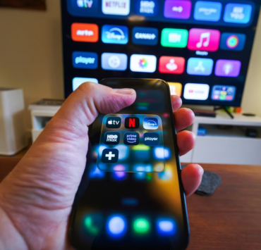
Many players use casino sites on their phones. That means the mobile version cannot be a smaller copy of the desktop site. It should be easy to use on a phone.
Buttons should be easy to tap. Text should be easy to read. The balance should not hide behind three menus. Game tiles should not be so small that every tap feels risky.
A mobile casino also needs to handle real-life use. People may be on a sofa, in a car as a passenger, or using weaker internet. The site should still feel steady.
Speed Changes Everything
Slow loading makes players nervous. If a game takes too long to open, some players wonder if something went wrong. If the cashier page lags, that feels even worse.
Speed is part of trust. A fast site feels more professional. A slow one can feel careless, even when the games are good.
Casino pages carry a lot of heavy content. Game images, live dealer streams, animations, payment tools, and account pages all need to work together. Still, the player should not feel that weight. A fast site respects time.
Pop-Ups Should Know When to Stop
Pop-ups can help when they share something useful. One welcome message may be fine. A payment notice may be needed. A reminder about terms can be helpful.
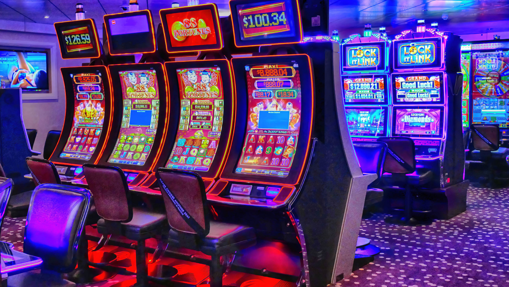
Too many pop-ups feel rude. Some sites block the screen again and again. Bonus offer. Newsletter request. App download. Cookie notice. Free spin message. Chat prompt. The player has not even reached the lobby yet, and already the site feels pushy.
A calmer approach works better. Let players enter. Let them look around. Show offers in a clear place without forcing them to close five boxes first.
Colors and Text Affect Comfort
Some casino sites use too many bright colors. Bright colors can look fun at first. But after a while, they can hurt the eyes.
Colors should guide players. Important buttons should stand out. Warnings should be easy to notice. The background should not make text hard to read.
Text should be big enough too. Small grey text may look nice, but it is hard to read. Rules, payment pages, and support pages should be clear without zooming in.
Trust Comes From Clear Details
Trust is not built only through logos and badges. It comes from the way information is shown. License details should be easy to find. Payment rules should be easy to understand. Bonus terms should not feel hidden. Withdrawal times should be explained in plain language.
Players can sense when a site is trying to be clear. They can also sense when a site is making things hard on purpose.