Best Interior Paint Colors for Small Updates That Make a Home Feel Finished
A house can be spotless and still look tired. That is the frustrating part. The floor is clean, the furniture is fine, the decor still works. But the hallway has scuffs. The trim looks dull. One living room wall has a mark that has somehow become part of the room.
Paint fixes more than people expect. Not always in a dramatic way. Sometimes the change is quieter, while other times it involves injecting bold colors through cleaner doors, softer walls, fresher cabinetry, or a ceiling that finally works with the rest of the space. The best interior paint colors are not always the passing color trends trending online. They are the ones that suit the room in front of you.
Popular Paint Colors Can Look Different at Home
Just like shifting trends in fashion, popular interior paint colors are moving warmer now. Beige, brown, Sage Green for a calming feel, muted green, soft blue, warm white, and earthy neutral shades feel more inviting than the icy gray interiors that were everywhere for years. Moving past the vibrant hues and deep purples that defined last year’s palette, 2026 has embraced rich, grounding tones like amber, terracotta, and deep forest greens as key trends. Sherwin-Williams and other major brands have fully leaned into these organic, saturated warm tones, perfectly aligning with our current desire for cozy, nature-inspired spaces.
The most popular colors are tricky, and choosing them for a room takes careful consideration because light and existing finishes can shift how they read at home. Beige can look warm in one room and flat in another. Gray may feel calm with enough natural light, then turn cold in a shaded hall. White walls can look bright and clean, or too sharp beside old wood, stone, warm furniture, and softer decor.
That is why the room should lead the choice. Not the trend. Not the tiny square on a paint card. If the house already has dark cabinetry, heavy furniture, yellow-toned floors, or a strong fireplace, the paint colors need to balance those features. A neutral shade like Alabaster can calm the room. A deep green or blue can add depth. Brown paints can bring warmth, beauty, and timeless appeal when the rest of the palette is not too heavy.
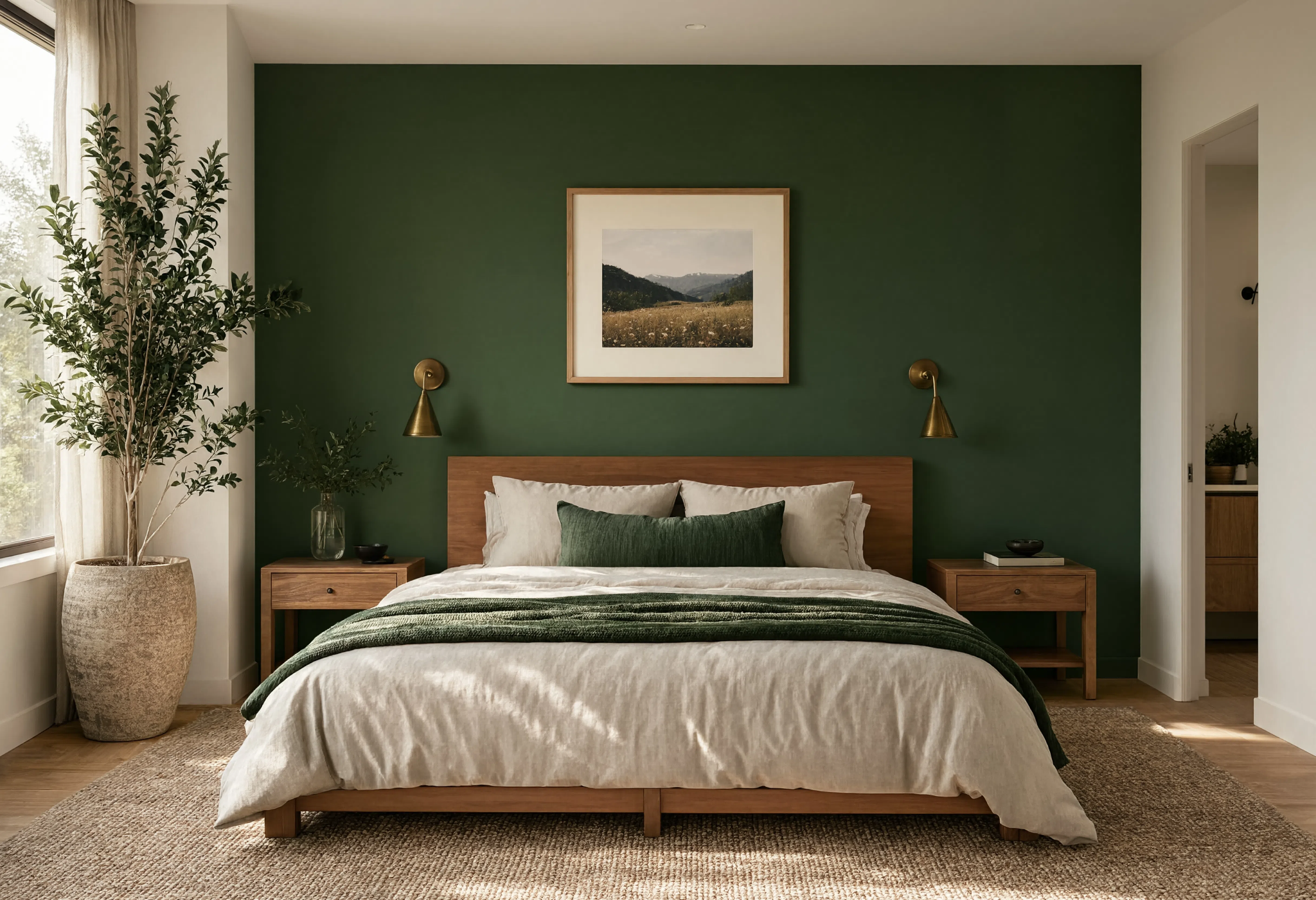
Giving Accent Walls a Job in the Living Room and Beyond
Accent walls can add drama, but only when the wall deserves attention. A random dark wall usually looks like a leftover idea.
Navy blue will always be appropriate if you want to achieve a look that is classy. Terracotta, amber, and lush green are the colors that are considered a trend when it comes to accent walls for 2026. Even such grounding color like warm and dark brown may give your interior a luxurious look without making it entirely dark, thus moving away from cool grays. Saturated colors will never go out of fashion. They become even more popular, although still they should be balanced.
Sometimes a softer, earthy shade does the job better, but these bold, organic colors work beautifully when the wall has a clear focal purpose and the rest of the room is balanced.
The best accent walls are placed where the eye already goes: behind a bed, around a fireplace, at the end of a hallway, or in a dining corner. In a living room, an accent wall is a great place to make the space feel more grounded.
Color Drenching Is Not as Scary as It Sounds
Color drenching means using shades from the same color family across the walls, trim, and sometimes the ceiling, not just the exact same hue. It sounds intense. In small spaces, it can actually make the room feel cleaner and more complete.
A powder room, reading corner, small bedroom, or narrow hallway can benefit from that wrapped-in color effect. Monochromatic designs can make small spaces appear larger by reducing visual breaks. There are fewer hard breaks, so the space feels more intentional. Soft green, dusty blue, warm beige, or a quiet neutral can work well.
The shade matters, though. Too dark, and the room may feel heavy. Too bright, and it can feel busy. This approach can also help complement simple furnishings instead of competing with them. Interior designers usually test more than one sample for a reason.
Trim, Doors, and Ceilings Do a Lot
Trim is easy to ignore until it gets painted. Then the whole house suddenly looks cleaner.
Baseboards, door frames, window trim, and old doors collect chips, dust, fingerprints, and uneven touch-ups. Crisp whites create clean lines in newer interiors. Softer whites often suit older homes better. Dark trim can look beautiful too, but only if the room has enough light. Paint is also a powerful tool for highlighting trim, doors, and ceiling lines when those details are in good condition.
Doors are another easy win. Making a bold statement with a painted front door, interior door, or cabinet door can shift the style of the room without changing the furniture. Refreshed cabinetry can make a kitchen feel less worn, especially when the walls are kept calm.

Ceilings deserve a real look too. Plain white is fine, but not always best. Warm off-white can soften a room. Pale blue can feel light. A deeper ceiling color can create a cozy mood if the walls and furniture are balanced, and painting the ceiling can be a fun way to shift the room’s mood without replacing decor.
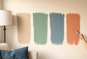
Test Before Painting the Whole Room
Tiny paint chips help, but they do not tell the full story. Screens are even less reliable, so use tools to visualize colors before testing samples on the wall. Paint a large sample and look at it in morning light, cloudy afternoon light, and at night. These are simple tips before committing to the whole room.
Hold the sample next to trim, flooring, furniture, and decor to see how the paint interacts with the texture of different fabrics, woods, and wallpaper, since matching paint colors to wallpaper can create a tailored design. If the room has little natural light, be careful with gray, blue, and deep shades. They can shift fast.
Seattle homes make this even more noticeable. Cloudy days, shaded rooms, damp areas, and older woodwork can change how interior paint colors read. That is why some homeowners work with professional painters in Seattle when the finish matters as much as the color.
When to Consult a Color Expert and Professional Painter
Some painting updates are simple. One wall. A bedroom. A hallway touch-up. Maybe trim in a living room. Others are not so simple. Glossy trim, peeling paint, stained walls, patched drywall, cabinets, and old doors need prep. If the surface is not cleaned, sanded, primed, or repaired, new paint will show every flaw underneath. A color expert can also help when interior changes need to coordinate with nearby exterior elements or other fixed features.
That is when a professional painting contractor can be the smarter choice. Not because every job needs one, but because bad prep makes even expensive interior paint look cheap.
Small updates should not feel random. Cleaner trim, warmer walls, better accent walls, refreshed cabinetry, or softer ceiling color should support your decorating choices and create a sense of harmony with the rest of the house. Not perfect. Just fresher, calmer, and easier to live in, with earthy, modern palettes that often take cues from nature.